Nobody has a crystal ball – that’s obvious. Analysts, economists, traders, and investors all try to decode what will happen in the future, looking for warning signs that appear earlier. For technical analysts, indicators include divergences, moving average crossings, RSI oscillator readings, and price formations. For people who focus on fundamental analysis, these may primarily be companies’ financial results, and for economists, they may be labor market results, inflation readings, and Fed decisions.
So, what specific indicator is under discussion here?
Understanding the Markets
Markets usually get ahead of reality, or as they say nicely, discount it. These can be stock markets, commodity markets, or even cryptocurrencies – however, it is not from these sources that the current signal comes. Yes, the ones described above react in advance to what may happen soon in the economy. What is more, they often start to grow before the recession in the economy actually ends (for example, the stock and cryptocurrency markets in 2020). Still, they are often perceived as a mix of smart and dumb money.
Which market is left?
Bond market: smart money?
Bonds, unlike stocks, are debt instruments, not equity instruments. Simply put, when we buy stocks, we buy a part of a business, and we are its shareholders. Regarding bonds, we only lend money to a given entity at a specified percentage. This percentage is called yield and is inversely correlated with price – when the price of a bond increases, yield decreases, and vice versa.
But more on that later.
Bond market: strength in peace?
It is important that the bond market is very calm, mainly involving large investors who are trading gargantuan assets. For this reason, it is also attractive to them. If we want to keep large amounts of cash in anticipation of various market opportunities, the bond market (especially American bonds) provides attractive opportunities to park funds at a certain percentage (the so-called risk-free rate).
No, this is not just theorizing. Let us take as an example the actions of perhaps the most famous investor in the world – Warren Buffett. At the time of writing this article, he is the 6th richest man in the world, with an estimated net worth of $146 billion.
His investment vehicle is Berkshire Hathaway, which he uses to make purchases. As his portfolio indicates, he currently holds about $316 billion in stocks, and his financial reserve is a staggering $277 billion, an increase from the previous record of $189 billion in Q1 2024. One of the significant factors contributing to Berkshire Hathaway’s record cash reserves is the large-scale stock sales carried out in the second quarter of 2024. Warren Buffett divested over $75 billion worth of equities during this quarter, adding up to more than $90 billion in stock sales in the first half of 2024. Most of these sales included nearly halving Berkshire’s stake in Apple and consistently reducing its holdings in Bank of America.
Of the $277 billion BH reserves, $234.6 billion is held in Treasury bills.
Yield Curves: Grasping its phenomenon
Although it sounds pretty scary and dull, it is quite simple. The yield curve is a graphical representation that shows the relationship between the interest rates (or yields) of bonds with the same credit quality but different maturity dates. Essentially, it plots the yields of bonds on the vertical axis and their maturities on the horizontal axis. The shape of the yield curve is what matters the most.
When we lend money to someone for a more extended period (maturity), we usually expect a higher interest rate (yield). This is because much more can happen in such a time – the creditor might go bankrupt, and so on. Hence, the interest rate on 2Y bonds should be lower than that on 10Y bonds. And it is – but only since today.
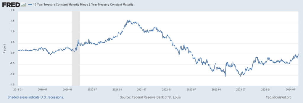
The above chart shows the difference between US 10Y and 2Y bond yields. When it is above the thick horizontal line, it is positive, which means that the interest rate on bonds with a longer maturity is higher than on those with a shorter term. When we are below the line, we can earn more on the yields on short-term bonds.
On August 28, 2024, the reading showed a positive difference of 0.01 again from September 3, 2019. After 5 years, the yield curve inverts again.
Interest rates, curves, and capital allocations
And again, a confusing title. But only in name because what lies behind it is not that complex. It is essential to understand that a bond’s yield with a given maturity is derived from market expectations regarding the formation of interest rates at a specific level in the future. When the difference between 10Y and 2Y is negative, the interest rate on 2Y bonds is higher and 10Y lower. This means that the expected future interest rates are lower than the current ones. Since interest rates are essentially the price of money, their current and future level can be one of the most critical pieces of information for investors.
So, what do interest rate cuts on the horizon mean?
The Fed’s mandate is to look after inflation and the job market. This means that the ideal environment for a rate cut is low or falling inflation, as well as a weakening job market, which a shift to a dovish monetary policy could stimulate. Although, in the long term, the valuation of dollar-denominated assets is supported by easy money, the beginning of the monetary policy easing cycle is usually not very kind to markets.
What an inverted yield curve does is change the allocation of capital. Creditworthy companies’ bonds may have lower interest rates than treasury bills, so why buy them? These companies will manage anyway. Then, the risk-reward from investing in junk bonds (paying a higher yield) seems more attractive, even though the higher yield may come from a more difficult situation of the issuer. The cuts in financing these companies via debt, associated with transferring capital to different instruments, can bring a strong negative impulse to the markets.
And now, the most important thing…
Theory and practice, or how it used to be with an inverted curve
When we think of market crashes, the first thing that might come to mind is the GFC of 2008, bank failures, panic, and the end-of-the-world atmosphere. However, we don’t have to go back 16 years, as we experienced a similar event just over 4 years ago.
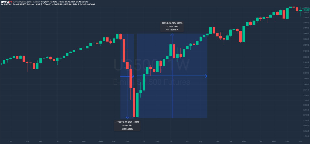
S&P500 panic of early 2020.
What we see on the chart above is a 4-week panic on the world’s leading benchmark, the American S&P500. The declines reached almost 36%, and the index recovered losses for 21 weeks, growing by over 56%.
This panic naturally resulted in exceptional rate cuts and quantitative easing, significantly inflating the prices of risk assets. The question is, however, whether any warning signal appeared beforehand.
The yield curve again.
Scrolling up the page, we come across the same chart. See how the difference literally kisses the horizontal zero line and then reverses? This gentle crossover occurred on September 3, 2019, while the S&P500 peaked locally on February 19, 2020. On the chart, the recession period is marked in gray.
Time from curve inversion to local peak on S&P500: 6m
Duration of declines: 1m
Drawdown: 36%
Inverting the Curve: Let’s go back even further
One swallow doesn`t make a summer. Is the inversion a one-time phenomenon, or has it actually occurred before? And if so, what happened in the markets afterward?
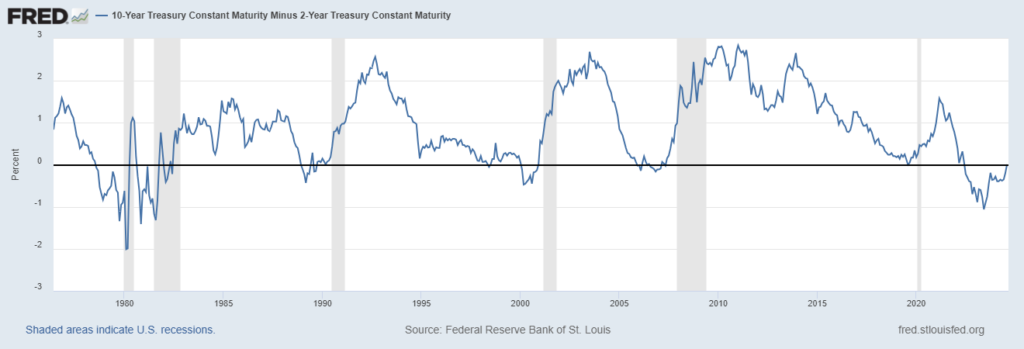
A long-term view of the US yield curve.
Et voilà! Almost 50 years of the difference between 10Y and 2Y yields in the chart above. 6 recessions, and even more reversals. Let’s analyze them together.
GFC 2008
The Great Financial Crisis and its causes are a must-read for every investor. Unfortunately, this post would be too long to include that, so let’s move on to the data.
By the Way, the difference came positive several times before the crisis hit.
When the difference turned out positive: March ‘06, August ‘06, March ‘07, June ‘07
Time from curve inversion to local peak on S&P500: 19m, 14m, 7m or 4m
Duration of declines: 17m
Drawdown: 57%
Dot-com bubble 2001
A crisis that preceded the GFC by just 8 years. What was the situation like in that case?
When the difference turned out positive: July ‘98, January ‘01
Time from curve inversion to local peak on S&P500: 25m, 5m after the peak
Duration of declines: 26m
Drawdown: 49%
1990 drawdown
Strong market correction from 34 years ago.
When the difference turned out positive: July ‘89, Oct ‘89, April ‘90
Time from curve inversion to local peak on S&P500: 12m, 9m, 3m
Duration of declines: 3m
Drawdown: 21%
1980 crisis
The recession with multiple causes, including the tightening of monetary policies by the United States and other developed nations, exacerbated by the 1979 energy crises.
When the difference turned out positive: July ‘79, May ‘80, Oct ‘81
Time from curve inversion to local peak on S&P500: 16m, 6m, 11m after the peak
Duration of declines: 21m
Drawdown: 27%
Conclusion: The power of the yield curve
First of all, it should be emphasized that something that has happened even several times over almost half a century and had specific effects does not necessarily have to have the same effects again. Although it sounds like a platitude, the very operation of the Federal Reserve has changed significantly since Volcker’s time. Many new instruments have been added, the method of communication has changed, and the approach to managing liquidity in the system has become much more lenient.
What’s more, the recession and stock market corrections occurred in significantly different periods, depending on what we counted as the last inversion of the curve. Sometimes, it was as long as 25 months, and sometimes, the curve inverted in a lasting recession. Declines reached 21% to 57% and lasted 3 to 26 months. Quite a different data, right?
What is definitely worth keeping in mind is the market conditions we are currently in. The labor market, the results of listed companies, the inflation rate, and the announcements of the Federal Reserve should be monitored meticulously.
Such a difficult task, but how interesting!
The information provided on this website does not, and is not intended to, constitute investment advice; all information, content, and materials available on this site are for general informational purposes only.


